Driven by a strong commitment to ethics, sustainability, and accessibility, I excel in relationship building and product research and design. Always ready for a new challenge!
Fabio Cimo
Product Designer Researcher Strategist

Fabio Cimo
Product Designer Researcher Strategist
Fabio Cimo
Product Designer Developer Researcher
-
Fabio Cimo
About Me
I'm a software engineer turned Product Designer who strives to create functional and human centered designs. During the past 5 years, I've helped shape new and existing products in industries like gaming, reality capture and e-commerce!
UX Skills
Design - Figma, Adobe XD, Sketch90%
Research - Maze, Condens, Airtable75%
Data Analysis - Mixpanel, Grafana, Data.ai60%
Work Timeline
Education Timeline
-
2016 - Present
Product Design
LinkedIn Learning -
2013 - 2016
Computer Science
Polytechnic of Tirana
Language Skills
Creative Portfolio
Pulse App
Health CheckupsProblem Statement
Each year, nearly 900,000 Americans die prematurely from the five leading causes of death – yet 20% to 40% of the deaths could be prevented through regular medical checkups, according to a study from the Center for Disease Control and Prevention .
My goal was to identify the major pain points within the checkup booking process that users don't have a solution for and build an app to alleviate the issue.
User Research
I interviewed 5 people that met my screener criteria: has booked a medical checkup at least once and is familiar to the use of online resources to address their health concerns.
I wanted to understand the current methods of checkup booking, pain-points as well as thoughts and attitudes of my target audience. Some of the questions I asked were:
- What steps do you take to schedule a health checkup?
- Have you encountered pain points during or after the process of booking?
- Are there any apps in particular that you use to book routine checkups?
- How did you receive your test results the last time you went for a medical checkup?
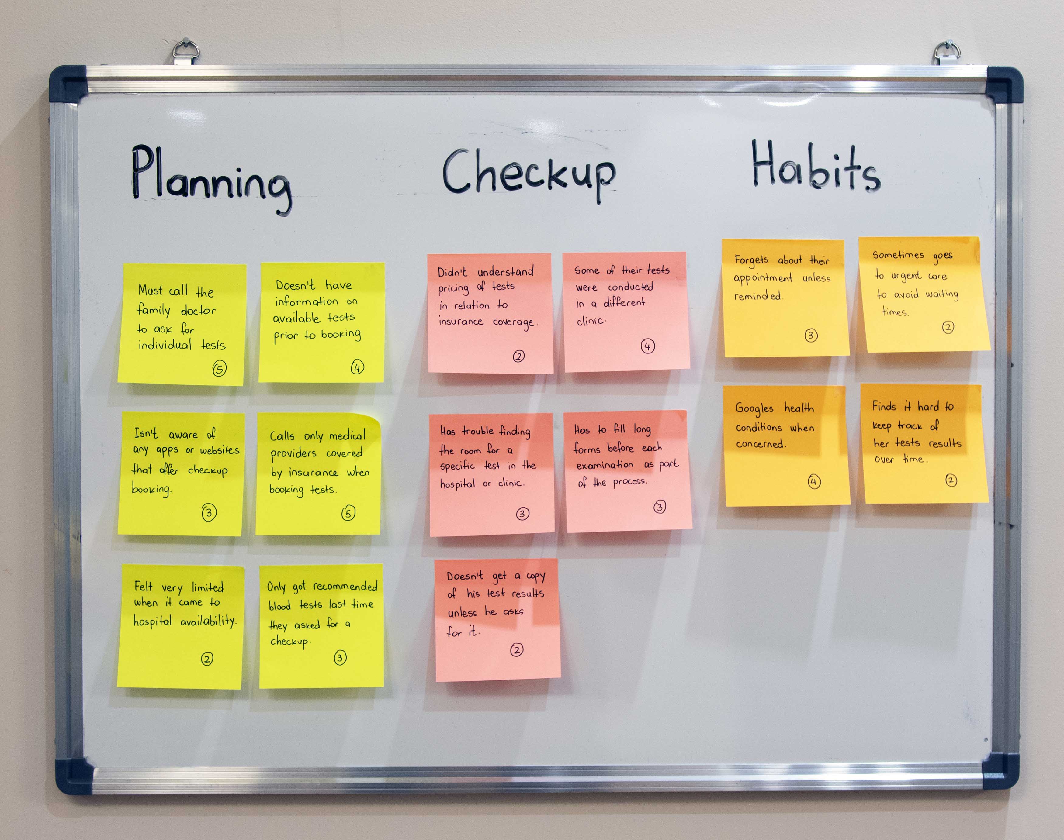
Affinity Mapping
After the interviews, I used the process of affinity mapping to discover trends and common themes. I was able to uncover a few major trends, including:
- Scheduling appointments is the most challenging part of medical checkups.
- People typically ask the family doctor for any checkup tests they want.
- There's a lack of information throughout the process.

User Journey Map
I created a journey map to visualize the process that Emma currently takes to accomplish her goal. This helped understand her experience better and learn about her pain-points.
Design Rationale
From my research, the following insights eventually informed my design decisions.
- Fragmentation of services is the elephant in the room for this industry.
- People want a way to schedule routine checkups conveniently and efficently.
- There are a number of areas people have difficulty navigating, including booking, attending medical exams and receiving results.
Prototype Video: Pulse App - Schedule Checkup
User Testing
I used high fidelity prototypes on an iPhone from the Figma app to conduct user testing. The following tasks were given to each of the users:
- Register as a patient for the first time on the app.
- Book a health checkup consisting of specific tests, for the date June 28, 2022.
- Browse your July 28th, 2022 checkup results and download your ECG graph.
Due to the nature of this app, the Check In feature can only be tested properly at the MVP stage of the product given its dynamic functionality (QR codes, barcodes).
Findings & Takeaways
A number of re-designs along the way helped reduce issues to a minimum and provide a great user experience. However, from the usability test and a few surveys, I concluded:
- Users didn't really understand the Check In feature of the app.
- Since this project strictly focuses on the patient experience, the next step would be to build out the hospital dashboard that will accomodate all patient requests and their medical information and will be used by medical staff.
Two ways I plan to address this issue are:
(1) rename the feature to give users a better understanding of its purpose,
(2) introduce it at as part of the onboarding screens
Personal Impact
I dedicated about three months to this project and was impacted in the ways that follow:
- I became more sophisticated in my research in terms of depth and quality.
- For the first time, I built a meaningful product for the society from scratch.
- The biggest lessons came from critics of the app and their take on its features.
Business Impact
Pulse has the potential to both create new industries and complement existing ones:
- Pulse can be built as a standalone app for a new industry that doesn't exist in many countries - clinics that specialize in medical checkups only.
- Pulse functionality can very well be implemented into an existing hospital app to extend its functionality and reach of patients in need for these services.
Explorer Web
Trip PlanningThe Story
It's 2018, and I'm planning my much anticipated trip to Bali, Indonesia. I spend days researching transportation, accomodation, attractions, bars and so on. By the time I was done, it felt like I had completed several assignments and handed them off. But it shouldn't, because travel is supposed to be fun and relaxing.
Browing travel websites and apps, one particular aspect stood out to me: Trip planning was inexistent and that was a huge opportunity. So I set out to provide a framework of how trip planning should work and lay out a reference to all stakeholders in the industry.
Project Goals
The following goals guided my research and design:
- Define the user flow of planning a trip.
- Conduct competitor analysis to understand their strengths and weaknesses.
- Create a consistent design system for the trip itinerary.
- Establish a priority matrix to decide what features should be developed first.
- Build a high fidelity prototype to test with a select number of users.
User Flow
To increase engagement and user satisfaction with this product, Step 2 has been added to provide tailored suggestions which are visible to the user on Step 3 - Itinerary Page.
Competitor Analysis
During this stage, I spent a few days exploring apps and websites that offered trip planning. I wanted to understand what features where most important to users and how did these services compare with ours. As it turned out, all competitors missed the booking capability which refers to options like flight booking, hotel booking, attraction ticket booking etc. Given how users don't like to be redirected and complete their bookings in multiple websites, this feature is what made my product unique and valueable.
Priority Matrix
In order to understand what features should be implemented on the MVP, I rated and analyzed each feature in terms of their impact to the user and effort in developing them in respect of resources. The matrix below provides a clear view of MVP feature prioritization:
Design System
The following elements were considered when creating the design system.
CARDS
Card design was inspired by a plane ticket and represents each activity in the itinerary. Special attention was paid to the ratio of each section and their purpose in communicating relevant details.
ICONOGRAPHY
For the icons, I chose a two-color style that will match the card design over which the icon is placed. The second color serves the aesthetic purpose of giving each icon a bit of depth.
COLOR
In order to make each category easy recognizable, I decided to use distinct colors for each category.
TYPOGRAPHY
For the typeface, I chose Sweden Sans. It's simplicity combined with unique details makes the typeface practical and versatile for the purpose of this website.
⚠️ Work in Progress - Expect Updates Soon
Personal Blog

As UX designers, we want as many people as possible to be able to use our site with ease. Everyone should be able to experience our site or app so it’s important to make it as accessible as possible for users with disabilities.
Types of Issues
There are several accessible design issues for users with disabilities that might come up. Here are some of the most common ones:
- Auditory impairments — difficulty with hearing
- Visual impairments — such as color blindness
- Visual impairments — such as color blindness
- Mobility impairments — concerns related to users of wheelchairs
- Cognitive or learning impairments — such as dyslexia
- Incidental issues — such as sleep deprivation
- Environmental difficulties — such as using a mobile device underground
How to make your site more Accessible
- Add Alt text to images
- Make your site work with a keyboard
- Make sure all content can be accessed by a screen reader
- Use clear headers and good structure
- Design color schemes with color blindless in mind
If you’re adding images in WordPress, you’ve probably used the alternative text field. This text acts as a replacement for the image if the image fails to load. The alt text is also read by screen readers as a way to “read” the picture to those with visual impairments. If you spend an extra two seconds describing the image in more detail, it may give users that are using screen readers more context. Alt text can also help you improve your site’s SEO so it’s a win-win for everyone.
Websites need to work without a mouse. This is because a great deal of the assistive technologies that exist today rely on keyboard-only navigation. Therefore, it needs to be possible to access all pages, links, and content using only a keyboard. The most common way to accomplish this is to navigate with the Tab key. This will let the user go between areas on the page like links, forms, and buttons.
This can be a problem if some of the content on a website is dynamic or it can change when the page reloads. Many screen readers will only read a webpage as it appears when it first loads. If you want to use dynamic content, there are ways to tag the content to make the screen reader aware that the content is changing. WordPress has Plugins and Accessibility tools to help with this, but to follow inclusive design principles, make sure you consider screen readers when working.
Using clear headers, small sections, and a simple structure can make your content easier to digest, especially for those with short-term memory issues or cognitive problems. Use a good combination of text and images to separate sections on the screen as this will help such users to absorb the content without any difficulty and remember the layout of the page easily.
It’s important to make sure that the colors on your site contrast well enough so that everyone can see the difference between various elements on the site. The most important issue is having a font that contrasts enough with the background that it can easily be read. Ideally, you want to place a dark font against a light background. You also want to avoid headache-inducing colors that can cause eye strain, especially because many are still dealing with the negative health effects of eye strain caused by staring at screens for practically 24 hours a day while working remotely. It has never been more important for UX designers to consider designs that won’t be harsh on the eyes–no matter what your visual abilities are.
To Conclude
These are just a few places to start the journey of making your UX design more accessible, but this is only the beginning. There are many more things that you can do to consider users with differing visual, auditory, and cognitive abilities. Designing a more accessible website or app may seem overwhelming or frustrating. There may seem to be some obstacles in the way like practicality, viability, or communication with team members.
In this article, I want to take a moment and talk about the elephant in the room when it comes to our everyday work as designers - often overlooked by many designers and product managers alike in the industry.
What is design debt?
Design debt refers to the accumulation of design decisions that are made hastily or without considering the long-term implications. It can arise from a variety of factors, such as tight deadlines, limited budgets, and competing priorities. For example, a designer may choose to use a certain color scheme or typography that is trendy at the moment, but which may not be appropriate for the brand's long-term goals or user needs. Over time, these small design decisions can accumulate and lead to a product that is inconsistent or confusing to use.
Tackling strategies
Addressing design debt requires a combination of short-term and long-term strategies. In the short term, designers can prioritize fixing design issues that are causing the most harm or confusion to users. In the long term, organizations can invest in design systems, style guides, and design thinking training that can help to prevent design debt from accumulating in the first place. Ultimately, design debt is a reminder that design is not just about aesthetics, but about creating products and services that are user-friendly, consistent, and aligned with the brand's long-term goals.
One of the many questions that User Experience designers want to answer with considerable certainty is – “Which areas of my interface do people engage with emotionally or cognitively, more than others?”
Heatmaps hold the key to much of that deceptively simple question. Put simply, heatmaps are a rich visual interpretation of responses triggered by interacting with digital systems. A typical characteristic of the visual interpretation is the abstraction of large swathes of this interaction data in actionable quant – elements with most clicks, pages with deepest scroll depths and interface areas with the highest density of mouse movements, to name a few. This quantification has powerful ramifications for UX teams.
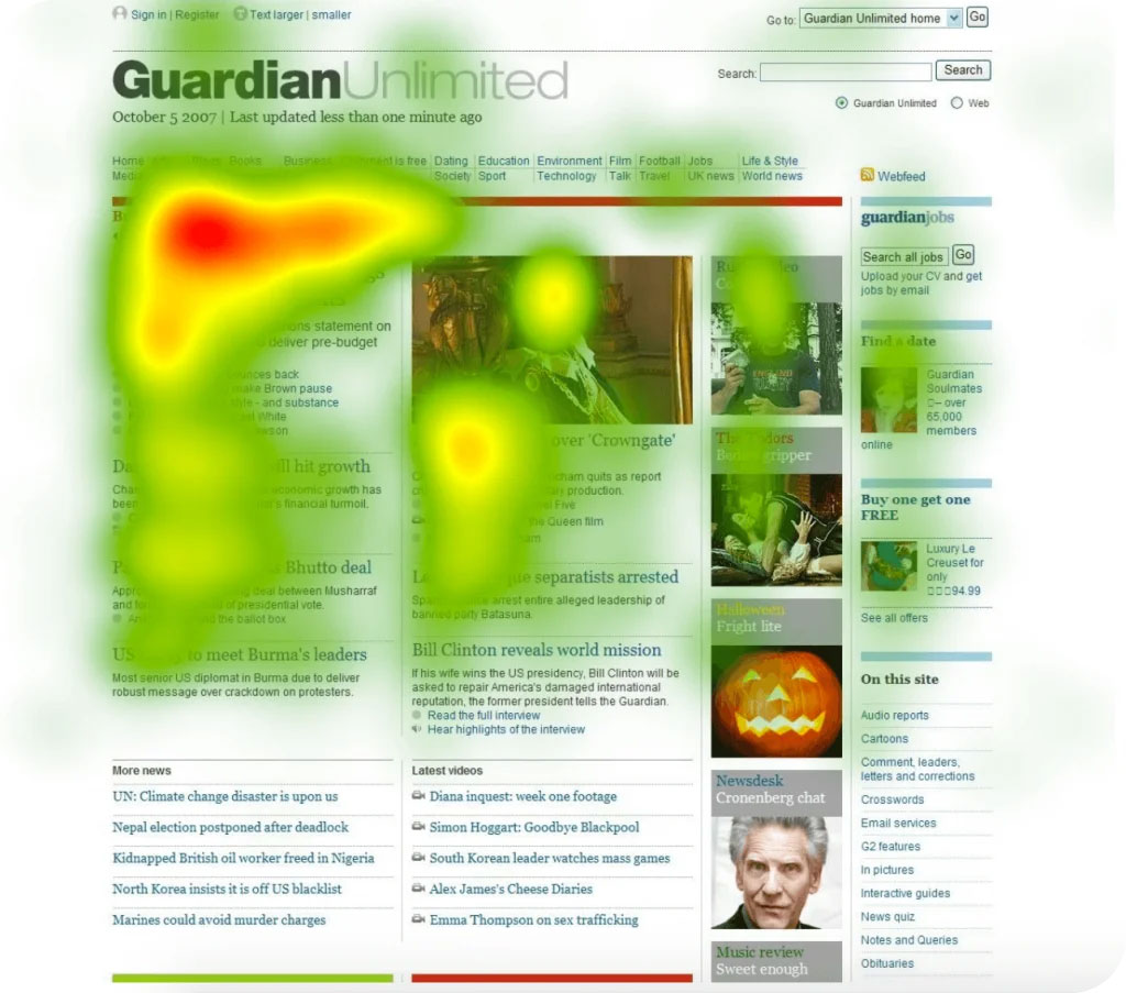
Click Heatmaps
Click heatmaps track of how many times each button is pressed. Warm colors are used to highlight areas with the most clicks, whereas cold colors highlight areas with the fewest clicks.
Assume that the analysis suggests that the orange buttons and the “Let’s do it” CTA wording are the most successful on your website. You can consider using that color and specific language more often to improve readability and enhance conversions.
Segment Heatmaps
Segment heatmaps provide a much more complex analysis than click heatmaps. It not only informs you which region of your website was the most popular, but it also tells you where that specific click came from. The software maintains track of the visitor’s origins and assesses the data accordingly.
When it comes to optimizing the UX, you can observe which platform brings in the most visitors and how they interact with your site. As a result, you can tailor your website to each segment. You can also find out the demographics of your visitors.
Scroll Heatmaps
Scroll heatmaps are mostly found on content-heavy interfaces, where it’s used to figure out how long articles are read on average. It is important data because you’ll be able to tell which parts of the article you should place a link to, and you can determine where you should write important information.
To Conclude
As we can see, there are more connections between web analytics and UX than we might think. It is recommended that you use heatmaps to optimize the user experience. You can use all the methods listed above together. You can combine other methods, such as split testing (a.k.a. A/B testing), to further leverage data in your design decisions.
In simple terms, Zero UI means interfacing with a device or application without using a touchscreen. With the increasing proliferation of the Internet of Things (IoT), touchscreens will eventually become out-of-date. Zero UI technology will finally allow humans to communicate with devices using natural means of communication such as voice, movements, glances, or even thoughts.
Haptic Feedback
Haptic feedback provides you with a motion or vibration-based feedback. The light vibration felt when typing a message on your smartphone is nothing but haptic feedback. Most smartwatches and fitness devices use this technology to notify the end user.
Voice Recognition
Speaking of Siri, the voice search and command itself is a component of Zero UI. Cortana, Google Voice, Amazon Echo, and Siri are a few examples of voice recognition-based Zero UI applications. This technology allows a device to identify, distinguish and authenticate the voice of an individual. That’s why it has found applications in security systems.
Face Recognition
Face recognition is also turning into one of the most popular Zero UI technologies. Most laptops and computers already use this technology to unlock screens. However, Apple’s new Face ID feature takes it to a whole new level. With this feature, you can unlock your iPhone with just a glance. There is no need to hold your phone to your face. It uses infrared and visible light scans to identify your face, and it can work in a variety of conditions.
Gesture-Based Interfacing
Gesture-based interfacing is available on a variety of smart devices. For example, Moto Actions, a gesture-based interface on Motorola smartphones, allows you to carry out tasks such as turning on the camera or flashlight without unlocking the phone. A bit more advanced example refers to Microsoft Kinect. You can add it to any existing Xbox 360 unit. It uses an RGB-color VGA video camera, a depth sensor, and a multi-array microphone to detect your motion.
In Conclusion
The Zero UI concept aims to make every community, marketplace, on-demand service, e-commerce site, and mobile application more interactive. However, this is going to open new doors for marketers and designers alike. Hopefully, this comprehensive coverage of the said topic will prove helpful in understanding its magnitude, consequences, and the opportunities it will create.